Brands manufacturing and shipping from Asia have relied on Trillora Packaging Solutions’ design and supply chain expertise for 25+ years to reduce costs,product damage, inefficiencies, and their carbon footprints.
New name, same focus on delivering results
Trillora Packaging Solutions, formerly Billerud Managed Packaging, is now a part of Sweden’s Mimir Group. Trillora continues to offer customized packaging solutions to global brands and retail chains, who benefit from our large network of production partners in Asia. Join our customers who have realized up to:
30%
In freight cost savings
Reduced packaging weight and optimized design are key to generating net cost savings for brands.
36%
Improvement in container usage
Filling a container as efficiently as possible requires an expert packaging designer to ensure you’re not shipping air.
80%
Reduction in product damage
Returns and waste eat into the bottom line. Design experts ensure packaging is protecting products, without overusing materials.
Results based on historical data. Individual program results may vary.
Our solutions are built around your success
Trillora acts as your full-service packaging department. We’re there from the early design, prototyping, and testing stages all the way through the production of your customized packaging and its delivery to your factory’s doorstep.
Design
Prototyping, development, and testing tailored to your needs. Save money without compromising quality. Strengthen your brand and sustainability with consistent solutions.
Produce
Leverage our industry expertise for consistent and controlled processes, greater efficiency, and exceeding industry standards. We emphasize sustainability and long-term value for your business.
Deliver
We oversee suppliers, quality, and CSR compliance. Technical expertise saves you time, improves operational efficiency, and assures a seamless supply chain experience.
Sustainability
Reduce your CO2 footprint
Advancing packaging sustainability
Trillora clients have eliminated more than 87 million kilograms of carbon dioxide from being emitted into the air, thanks to our use of fiber-based materials.
We’ve also replaced nearly 1 billion kilograms of plastic packaging with recyclable corrugated materials, and helped save 92 Olympic swimming pools worth of fresh water.
Our sustainability approach applies to any and all of our packaging categories detailed below.
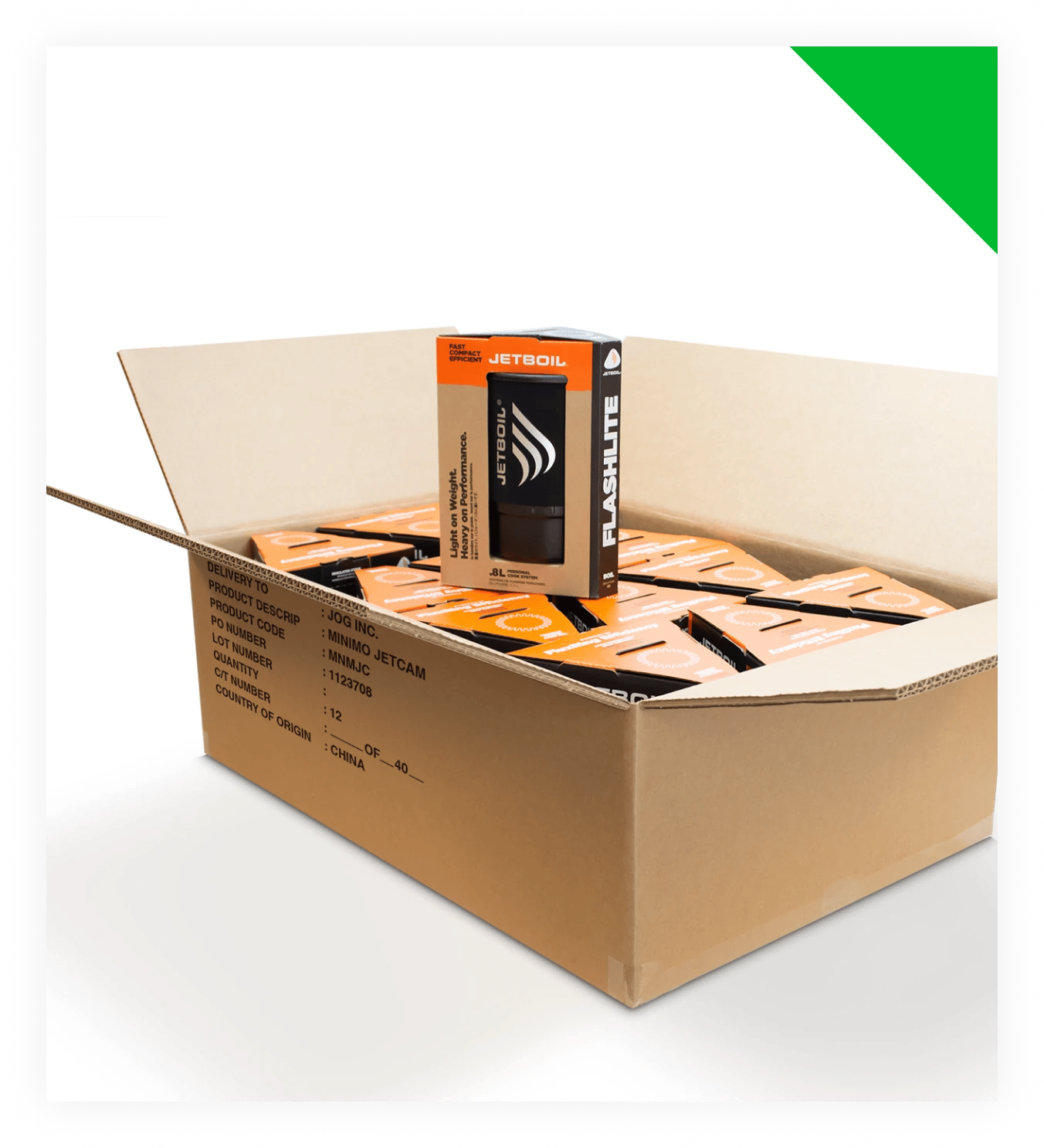
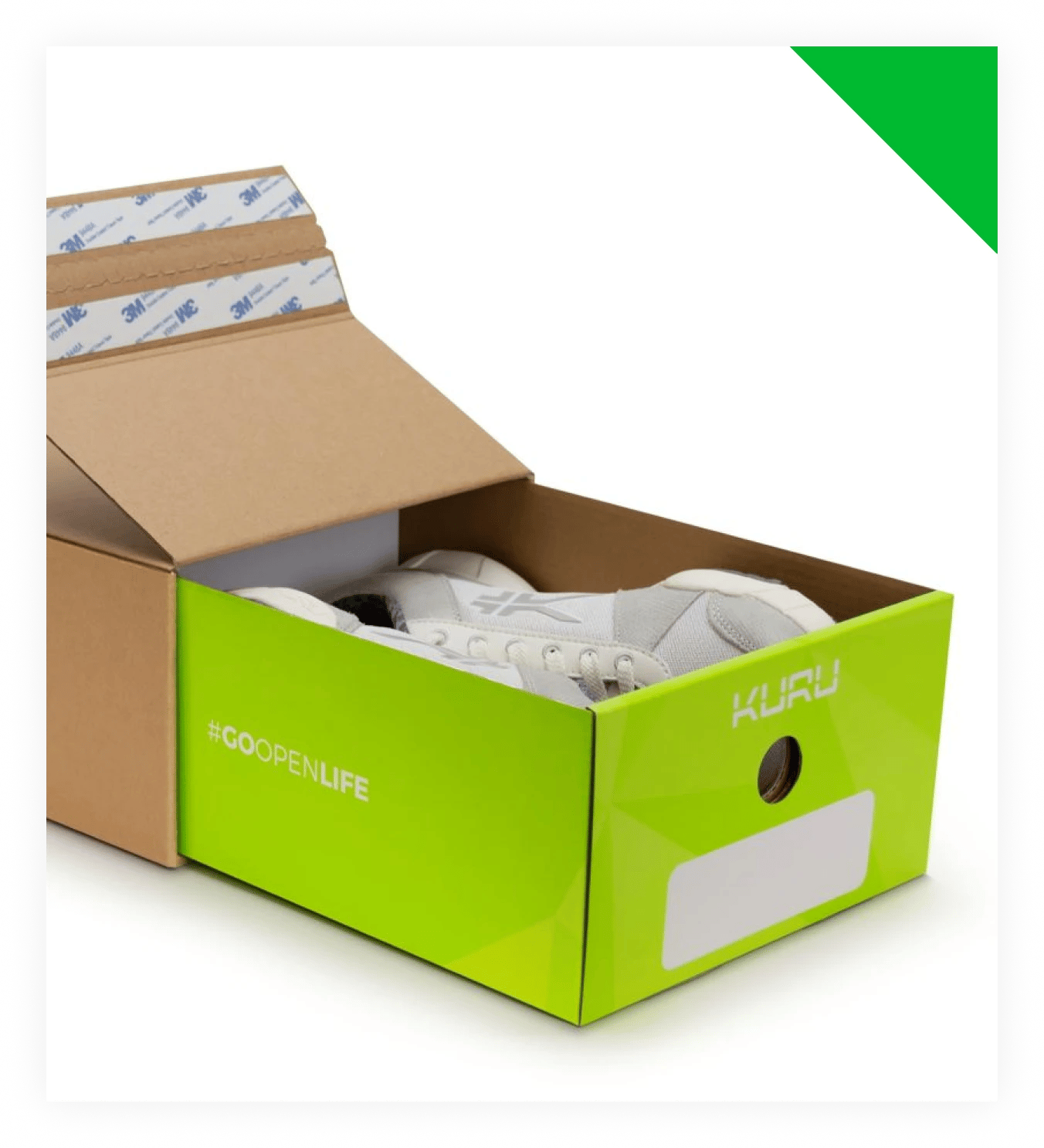
Solve for challenges in packaging design and quality
Trillora’s transport packaging is designed for optimal use of space and performance, from the factory to the distribution center.
Our consistent quality across factories and geography amplifies your brand experience and ensures your retail packaging arrives at stores in excellent condition.
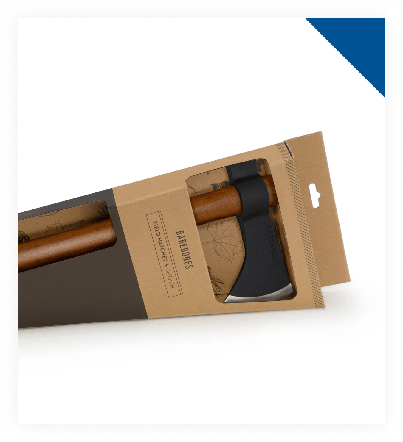
Reducing product damage is a core focus for Trillora. Protective packaging means shielding your products from the rigors of the supply chain while balancing the weight and amount of materials used.
Heavy-duty packaging requirements have shifted as supply chains have evolved. To protect your product, our designers and engineers create solutions specific to your distribution channels.
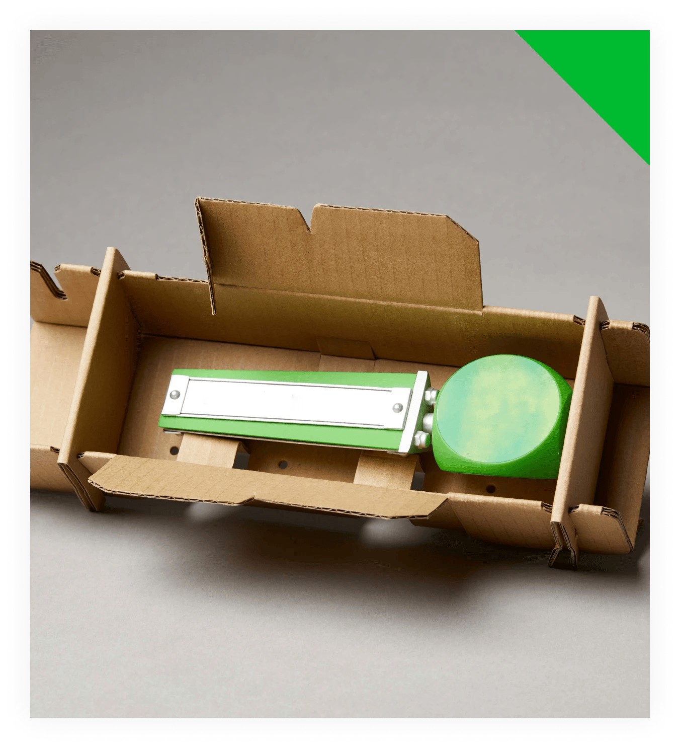
Ecommerce creates a complex supply chain that presents packaging challenges beyond that of traditional retail. Your product's journey is unique, and Trillora will customize a packaging solution to suit your needs.
Read ebook
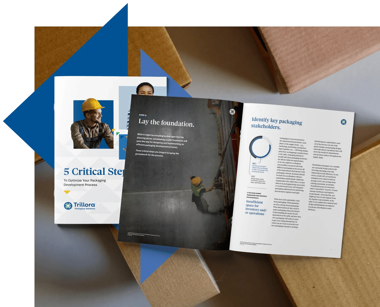
Five critical steps in packaging development
How do you take control of your packaging process and discover savings throughout the supply chain?
Our ebook gives an overview of the most important steps for creating a packaging program that minimizes waste and inefficiencies, while maximizing value for stakeholders and end-users. Click below to learn more.
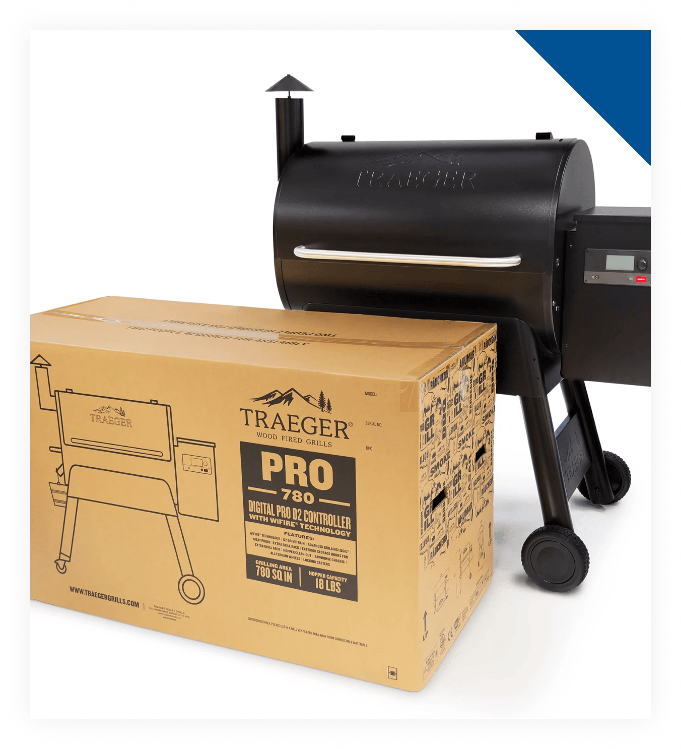
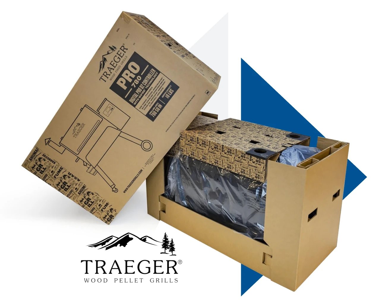
When renowned wood-pellet grill maker Traeger wanted to overhaul its packaging in a way that was more sustainable and that enhanced the customer experience, they turned to Trillora for help. Read the case study to get the details.
Are you shipping from Asia and struggling to make desired and beneficial changes to your packaging program? Trillora has helped numerous companies with those overhauls, with impressive results. Contact us today to learn more about how we can guide the way.